Printing accurate color in business involving brand integrity is not simply a technical issue but rather an element of brand integrity. The colors that a customer will see when looking at your brochure, business card and direct mail piece are literally a direct reflection on your corporation. Regrettably, screen perceive colors that are outstanding to paper are not always accurate. This paper details the ways in which companies can continue to produce the exact color output on all print products and the possible traps during the printing process.
Understanding the Difference Between Digital and Print Color
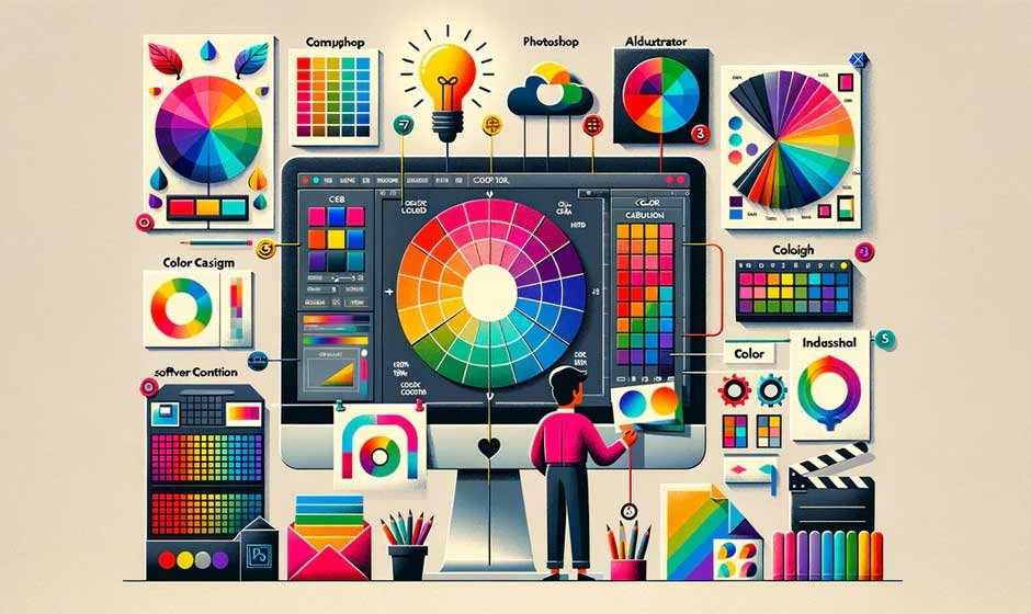
The discrepancy between digital and print color systems is one of the main issues of prerequisite to consider when effort is geared towards attaining the correct color. The digital displays are characterized by a light-based version of RGB (red, green, blue) color model. Printed materials are however dependent on CMYK (cyan, magenta, yellow and black) which is a subtractive colour model which is based on ink. The results achieved by these two systems can vary considerably and the print color (or image) may seem dull or distorted when it appears on the screen.
In meeting the need to fill the gap that exists between digital color and print color, the designers would have to employ CMYK values when carrying out the design process. Depending on what you see on the screen may lead to disaster at the printer. Design programs have soft proofing of many of them, which gives an idea of how the colors will look after being printed using CMYK values. Switching color mode and looking at CMYK equivalents takes a few seconds, and will go a long way to help ensure consistency throughout.
Working with Color Profiles and Calibration
Color profiles are very crucial tools, which assist in transferring color data between devices. These descriptions commonly known as ICC profiles show how colors must come out when using a certain printer or paper. Without them, color accuracy becomes a guessing game. The best bet to ensure that the design printed comes out perfectly as intended is to incorporate the right color profile to the design file and ensure your printer is capable of handling it.
Equally important is the calibration of your monitor. The brightness or improper balance of the screen can deceive even those designers who are well experienced. By calibration with the hardware calibrator on a regular basis, you will ensure what you see is the realistic picture of your design. It also makes sense to have physical proofs printed at least during big or significant print runs to ensure that the appointed color is correct prior to mass publication.
Maintaining Control Over the Print Environment
Another secret to accuracy in color is a regulated print environment. Conditions regarding the temperature, humidity, and, yes, even the dust, may influence ink behavior and paper quality. In case, companies have on-site print facilities, it is important to invest in adequate storage of paper supply and equipment that must be well maintained. A good paper shredder can also come in handy to get rid of test prints and keep sensitive or third party output confidential.
Continuous work with printers simplified by wiping the nozzles and refilling cartridges with ink produced by the manufacturer ensures steady stream. Minor changes in print hardware can add up eventually hence leading to observable changes in color. Frequent checks, calibration and workflows guarantee printed resources to be consistent in the visual identity of this brand and adhere to the professional requirements.
The Importance of Paper and Finishing in Color Appearance
The paper in which the printing is done may severely influence the appearance of the colors. Wet papers are glossy and arouse more high vibrant colors, whereas matte papers appear duller. The different weight and texture of papers also contribute towards the absorbency and reflection of ink. To find out the most appropriate paper, one can test several types of papers on the identical design and see which material will best accommodate the needed appearance.
The color perception can also be affected by the finishing process of lamination, UV coating or embossing. Such additions can modify the quality of the interaction between light and the printed surface, casting minute differences to the ultimate color of colors. Understanding these variables is essential for planning. One can use instruments such as a paper cutter machine to assist in the testing stage, to have clean samples that show the real deal of the final product.
Consistency Across Different Printers and Vendors
Most companies deal with several print suppliers or employ both an in-house and an outside printing solution. This may result in color variations in any particular output unless well handled. A great idea will be to have standard print specifications by all vendors. This involves providing precise values of CMYK, nature of paper, finishing and settings in print. It may also be useful in comparing results to keep a master sample of the approved printed materials so one can refer back to it.
Communication with your print vendor is another crucial step. Quality printers frequently welcome the involvement of specification information, and often will have recommendations as to how to correct color or alternate processes where fidelity is desired. Consistency can be maintained by means of long-term relationship with a trusted vendor, when it is possible. It is particularly necessary when it comes to branded materials, as having unusual colors such as mismatched colors can see a brand blighted with an unprofessional image.