What if the colours on your walls are doing more than just filling the space? What if they’re quietly shaping how you feel every time you walk into the room?
It’s not just design theory. Colour has a direct impact on mood, perception, and even energy levels. In home design, understanding the psychology behind colour isn’t about following trends. It’s about creating a space that feels right for you and everyone who steps through your door.
Why Colour Has Power in the Home
You don’t need a design background to notice that a deep forest green makes you feel different from a bright lemon yellow. But what’s happening is more than just personal preference. Colour interacts with our emotions in subtle but powerful ways. It can influence how we feel, think, and behave without us even realising.
That’s why choosing the right paint isn’t just a style decision; it’s a practical one. Experienced decorators, such as Oakfield Decoration, often approach colour choices by first considering what kind of mood the homeowner wants to create. Whether it’s calm, energy, or focus, the right shade can shift the whole tone of a space.
Paint might seem like the finishing touch, but in reality, it often sets the entire emotional backdrop of a room.
Understanding the Emotional Language of Colour
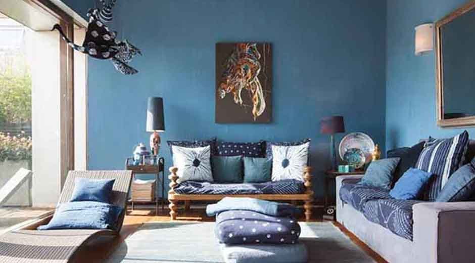
Blue – Calm and focused
Cool blues bring a sense of peace. They lower heart rate, promote mental clarity, and help reduce stress. That’s why they work so well in bedrooms, bathrooms, and home offices. But be careful. If the shade is too cold or paired with stark whites, it can feel clinical.
Red – Energetic and passionate
Red is bold, assertive, and full of personality. It raises energy and stimulates conversation, which makes it a popular choice for dining rooms or social spaces. But too much red can feel overwhelming, especially in small or dark rooms.
Green – Restful and restorative
Green strikes a balance between warm and cool tones. It feels fresh, natural, and grounding. It’s particularly effective in bedrooms or living rooms where you want to feel relaxed but not sleepy.
Yellow – Optimistic and uplifting
Yellow mimics natural sunlight. It makes small rooms feel more open and energises the mind. In kitchens or hallways, yellow can bring cheer and positivity. But again, moderation matters. Intense shades can cause agitation if overused.
Grey – Sophisticated and neutral
Greys offer flexibility. They sit in the background and let furnishings or artwork shine. Depending on the undertone, grey can feel warm and inviting or cold and distant. It’s not a mood-setter on its own but becomes powerful when used in contrast with bolder accents.
Black – Elegant and dramatic
Black adds depth, mystery, and elegance. A feature wall in a dark shade can make a space feel intimate and strong. Used well, black can elevate a room, but overused it absorbs light and shrinks space.
Room by Room: Matching Colour to Purpose
Different spaces call for different atmospheres. That’s why it’s important to think practically, not just emotionally, when choosing paint colours.
Living Room
This is often the most versatile space, and colour can reflect that flexibility. Warm neutrals, rich greens, or soft greys work well here. If you want something bolder, consider a statement wall in a darker tone to create depth.
Bedroom
Bedrooms need softness. Think pale blues, muted greens, gentle taupes. Anything that helps calm the mind and wind down. Avoid high-energy colours like red or orange, especially if you struggle with sleep.
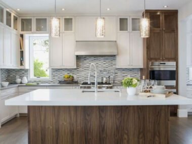
Kitchen
Kitchens thrive with light and energy. Whites, creams, light yellows, or even soft greens can make the space feel fresh and clean. If you want to bring in colour, go for it with cabinetry or tiles rather than covering all four walls in bold tones.
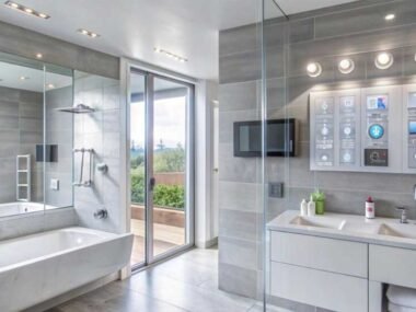
Bathroom
Soft blues and greens echo natural elements and bring a spa-like feel. White always works, but adding even a hint of pastel can warm it up and make it feel less sterile.
Home Office
Focus and calm are key here. Blue tones are ideal, especially when paired with crisp whites or warm neutrals. Avoid colours that are too vibrant or distracting.
It’s Not Just About the Colour, It’s How You Use It
The same colour can feel completely different depending on light, finish, and surrounding materials. Here are a few things to keep in mind when making your choice:
- Lighting– Natural light makes colours look different than artificial light. Always test paint samples in the actual room, at different times of day.
- Finish– Matte finishes absorb light, giving a softer look. Glossy finishes reflect light, adding brightness and drawing attention.
- Scale– Bold colours on one feature wall can create impact without overwhelming the space. Covering all four walls in the same bold shade can completely transform the room’s energy.
- Furniture and flooring– Think about how your paint colour works with everything else. Wall colour should support the space, not clash with it.
Let Colour Carry the Mood
The best spaces are the ones that feel natural to be in. That has nothing to do with the size of the room or how much it cost to decorate. It’s about feeling comfortable, calm, energised, or whatever tone fits the purpose of the space.
Colour plays a huge role in that. It affects not just how a room looks, but how it works. Whether you want to spark conversation in the kitchen or feel grounded in the bedroom, choosing the right colours helps you get there.
So don’t just choose what’s trendy or safe. Choose what works for you. When you get the colour right, the rest of the room starts to fall into place.