When planning a painting project, color choice becomes a powerful decision with long-lasting impact. Whether transforming a residential space or updating a commercial interior, selecting bold and neutral tones can influence everything from mood and perception to property value. While personal taste plays a role, professional painters often bring years of firsthand experience that reveals subtle patterns behind what works well and what doesn’t. Color isn’t just an aesthetic decision—it’s a strategic one. We will explore key considerations shared by professional painters to help you make a confident choice between vibrant hues and timeless neutrals.
What Professionals Consider When Choosing Between Bold and Neutral Colors
Purpose and Functionality of the Space
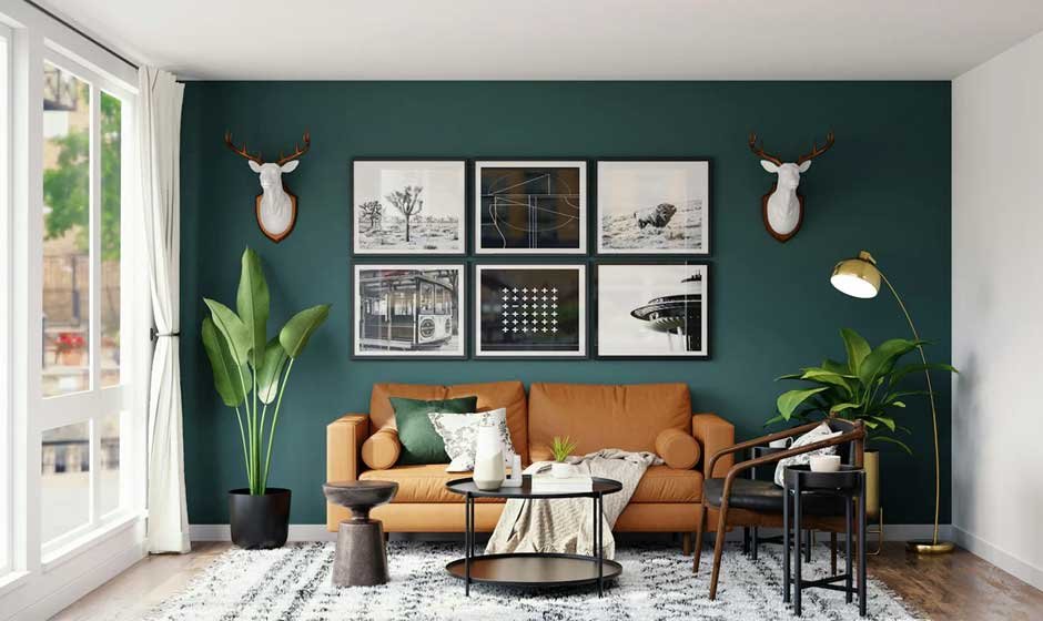
One of the first things professional painters evaluate is the purpose of the room being painted. Neutral colors often work better in areas where calm, focus, and longevity are priorities, such as bedrooms, offices, and hallways. These tones create a clean, unobtrusive backdrop that supports various furniture styles and seasonal decor changes. On the other hand, bold colors are frequently used to energize, define, or create a memorable impact in social areas like dining rooms, kitchens, or creative studios. According to painters at Dino Painting, color should amplify the room’s energy without overwhelming its function. For instance, a bold accent wall in a kitchen may energize breakfast routines, while an entirely bold bedroom might disrupt sleep. Professionals aim for harmony between tone and purpose, ensuring color supports emotional and functional goals.
Lighting and Spatial Impact
Professional painters often stress the importance of lighting when recommending color choices. Natural and artificial light interact differently with bold and neutral shades, significantly affecting a space’s feeling. In rooms with ample sunlight, bold colors can pop beautifully without overpowering, while in dimmer areas, the same hues may feel oppressive or too dark. Neutral colors, particularly light grays, whites, and soft taupes, reflect light more evenly, making smaller or darker spaces feel open and airy. Bold colors, while expressive, absorb more light and can make rooms feel enclosed if not balanced with adequate lighting. Painters often test patches of both types under different lighting conditions before settling on a recommendation. The key insight is to assess color not just in isolation, but in its natural setting, across all hours of the day.
Long-Term Versatility and Maintenance
From a practical standpoint, painters often guide clients toward considering long-term maintenance and adaptability. Neutral shades tend to age well, maintaining appeal as styles and preferences evolve. They’re also easier to repaint if future updates are needed. Bold colors, while attention-grabbing, can be more difficult to match or cover if a change of mood or ownership occurs. Painters often lean toward neutrals for broader appeal in rental properties or homes likely to be sold. Maintenance also varies; for example, bold colors might show chips, scratches, or scuffs more visibly than their neutral counterparts, especially in high-traffic areas. Professional painters advise clients to weigh how much time and effort they’re willing to commit to upkeep before going bold. It’s not just about the initial wow factor—durability and flexibility matter over time.
Emotional Tone and Psychological Effect
Another crucial insight shared by professionals is the psychological impact of color. Neutral palettes tend to evoke calm, balance, and minimalism. They’re often used in therapeutic, professional, or restful environments. Bold colors, however, can evoke excitement, drama, and personal expression. Painters frequently reference color theory when helping clients match emotional intent with design choices.
For example, deep blues and forest greens may feel bold yet serene, suitable for contemplative areas. Reds and oranges, on the other hand, energize and stimulate, which can be ideal for creative zones but less suitable for rest-oriented rooms. Professionals pay attention to how clients want to feel in a space and recommend tones that align emotionally. This emotional alignment can increase satisfaction and comfort, making the space feel more “right” to its inhabitants.
Architectural Features and Aesthetic Goals
Painters also examine the architectural context of a space before recommending bold or neutral colors. Neutral tones often emphasize clean lines and allow structural elements—like woodwork, crown molding, or built-in features—to take center stage. In contrast, bold colors can highlight or define specific architectural zones, such as alcoves, fireplaces, or staircases. Painters may recommend neutrals to let craftsmanship shine through when working in homes with historic or unique detailing. In modern settings where minimalism dominates, bold hues can be used strategically to create focal points and contrast.
Professionals often advise using bold tones sparingly, as accents rather than canvases, to avoid overwhelming architectural balance. They also examine how color complements or clashes with materials like stone, metal, wood, or tile already in the space. The goal is to create cohesion between the room’s bones and its color story, which requires a trained eye and thoughtful planning.
The choice between bold and neutral colors is more than a question of personal style—it’s a multifaceted decision shaped by function, lighting, maintenance, emotion, and architecture. We explored how professional painters evaluate these elements to guide clients toward colors that not only look good but live well in the space. Neutral shades offer adaptability, broad appeal, and understated elegance, while bold colors introduce personality, vibrancy, and dramatic flair. Both options have their strengths, and the best results often come from strategic combinations rather than choosing one over the other entirely. By understanding how professionals approach this decision, homeowners and designers can make informed, intentional color choices that stand the test of time.